In this analysis I will be looking at Saw and how they have used their trailers film posters in an effective way to engage their audience how they have kept a similar style throughout.By doing so I will be able to gain some form of knowledge on how to go about doing my campaign.
Posters


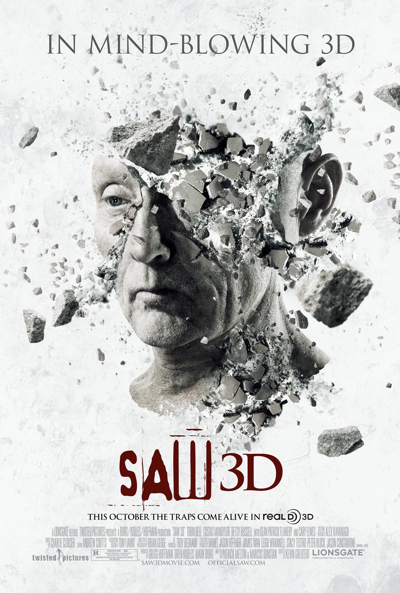
The saw franchise is undoubted extremely successful as shown by the release of seven consecutive films. Each film poster has all continued a specific theme of white and black and sometimes including red. This is so that it highlights the darker parts in contrast, most notably in the second poster where as if the poster where to have a black background it wouldn't stand out as much. The design is simple and gets the point across with each showing a different disturbing image. The word saw on each one shows the trademark font for the word so that the audience instantly knows.
Trailer
Within the trailer we are shown the story line that a bunch of people are being trapped in order to play a form of death game. we are then introduced to the main character and also his 'catch phrase' which is along the lines of "I want to play a game". The trailer is full of screams and people in confusion. There are fast paced jump cuts and towards the end the audio clips over lay to make it more overwhelming.
Magazine
In terms of magazine content this has none, this is due to the fact that anybody can walk into a shop and see the front cover of a magazine whether this be children or people who don't want to see aspects of horror in their every day lives. For this reason you will rarely ever find if a cover which shows a horror film.
No comments:
Post a Comment