Monday, 21 January 2013
Friday, 18 January 2013

Monday, 14 January 2013


Thursday, 3 January 2013
Final Evaluation
Alternatively if this doesn't work you can view the evaluation via this link:
http://prezi.com/kw3v5hc0y3sg/copy-of-a2-media-evaluation/?kw=view-kw3v5hc0y3sg&rc=ref-14156437


Film Poster & Magazine Cover plan
Here are the original plans for my Magazine cover and film poster below


Sound effects
Background Song
The sound track behind our trailer was chosen because it was already an chilling song made famous for its use within another film. We discussed various other tracks but came to the conclusion that this fitted what we had planned. We made sure we could use the song within our trailer by sending a letter asking permission to the original creator in order to abide by copy right restrictions.
Dog Barking Sound Effect
On finding sound effects we thought we wanted to re-enforce what was happening on screen. So when the 'beware the dog' shot came on we placed the following effect in to make it stick in the audiences mind.
Ambient Rain Sound Effect
Creating the trailer we never anticipated the chance of it raining but when it did it made an excellent addition and in adding in this sound we have a crisper sound instead on the minimal one we picked up on our camera.
Footsteps Through Leaves Sound Effect
This sound effect is used within the forest shots we couldn't find any more sounds like this so when we used it again we slighted modified the sound to stop it being repetitive.
Summery
Sound effects are extremely important in my opinion to the overall feel of the trailer, we are planning to use other effects as they so fit in editing.
Institution Choice and why?
For our institution choice we chose with Film Four and did so for a number of reasons. Below is the segment we used within our trailer to represent this.
Film four is a free digital television channel available in the United Kingdom and numerous other places. But as well as broadcasting films they also fund small independent films. We thought this was perfect for the idea we were going for. Knowing that Film Four have created various other films such as 'Four Lions' and 'This is England' we knew their style was an organic one that tends to not over produced.
Story Board & Synopsis
We believe that is was important to story board what we were going to do for our trailer before we even picked up a camera to ensure that we managed our time adequately. In doing so we mapped out exactly what we wanted and how we were to do it. It also gave us time to prepare ourself if issues were to arise and to also find mistakes we could have made. One example of this is due to us not having the most expensive camera and because we wanted to shoot in the dark we had to make sure we didn't film it too late.


Synopsis
'The Stalkers'
Genre: Horror
A group of friends out one night at Halloween. Unusual events unfold when they become targeted and stalked upon during the route home. They find themselves in a deserted place - lost between the forest and a stray tunnel which seems to lead to nowhere. With nobody to get hold of, no way of help - will they survive?
Location Shots
The Following montage is a collection of shots we took in the location we had taken footage.
We finished our filming within two nights and I believe are location choice was effective for what we had in mind. The choice of location came down to the aesthetic elements as well as efficiency due it being a place in which we could all meet easily.
We made use of the forested area and also the underground passage for the claustrophobic feel. I believe the contrast in open space and enclosed give our trailer the balance in setting it needed.


Venue Release Forms And Risk Assessment
Before doing anything we made sure we had taken the necessary precautions in order to make the project run as smoothly as possible.
Venue Release Form

Risk Assessments


Questionnaire Response


Conclusion
Conducting this research helped me discover what my audience found effective and ineffective it will help me progress my work and make it all round more fine tuned to my target demographic.
Theoretical analysis of film posters
The two film posters I will be analysing are of the genre I am trying to replicate which is Horror, in observing and picking out the key element I hope to create a better idea of what I am going to do for my poster and most importantly what it will show.
Sinister (2012)
Synopsis: Sinister is a supernatural horror It follows true-crime writer Ellison Oswalt as he discovers a box of home movies that puts his family in danger. The film employs "found footage" along with traditional cinematography. (Via Wikipedia)

The colour scheme used within the image is bland and highlights the dark red almost black blood used within the centre. The white and black contrasts against each other making each other seem more distinct and eye catching.
The textures upon the wall and floor are dirty and cracked intensifying the eerie atmosphere and creating an environment that isn't attractive or inviting.
The female within the picture is dressed in all white perhaps having connotations to innocence or even insanity due to the idea of the clothing people wear in insane asylums, we can also see that she is walking due to her body position and that she has also smeared blood across the wall. This shows the supernatural element that she could be possessed by an evil spirit.
Sinister is written very distinctively in the centre of the poster in the same colour as the blood a dark red almost inhuman Within the blood is a evil looking face staring directly back at the observer. It would be impossible for a face like this to appear naturally and so it jumps back to the supernatural.
There is a review on the side which highlights the key words "terrifying" "scare" and "hell" so that the audience without even knowing will unconsciously process those words and know what they are reading is scary.
There are roles of film in the bottom right hand corner which are reference's to the story line noted above.
The Orphanage (2007)
Synopsis: The plot centers on Laura, who returns to her childhood home, an orphanage. Laura plans to turn the house into a home for disabled children, but a problem arises when she and Carlos realize that Simón believes he has a masked friend named Tomás with whom he will run away. After an argument with Laura, Simón is found to be missing. (Via Wikipedia)

The colours used within the poster are made to look as if it was taken an really long time ago almost as if it could just as easily be a portrait and not a photograph. Doing this helps the audience gauge what time the film is set in.
The woman within the photo seems as if she works at where the photo is taken and judging from the title and the ghost children that would be the orphanage itself.
She is facing the camera as if she is totally unaware of what is behind her and possibly it points to the plot line that she is oblivious to the fact there is a supernatural presence close to her. Although her body is in between the supernatural existence and us which could signify she is about to cross the border of knowing about them.
Behind her there are six children which we can tell from their blue tinted transparency that they are supposed to be ghosts which begs the question, how did they die? One of the children has a sack of some sort upon its head which once again may provoke curiosity in the viewer.
Conclusion
To conclude I would say that both posters do a good job of showing that they are horror movies and equally set the tone for their respective film.
Narrative theory
Narrative theory is that which tries to give a basis in which every story is told. There are four main theorist involved in trying to define what a narrative must include, these are; Vladimir Propp, Roland Barthes, Tzvetan Torodov and Levi-Strauss.
Posting My Questionnaire on Facebook
As shown below I have shared my media questionnaire in order to try and get a wide response and also a varied one. This will help ensure that I get a full perspective on what I need to know.

Analysis Of Campaign In My Selected Genre
In this analysis I will be looking at Saw and how they have used their trailers film posters in an effective way to engage their audience how they have kept a similar style throughout.By doing so I will be able to gain some form of knowledge on how to go about doing my campaign.
Posters


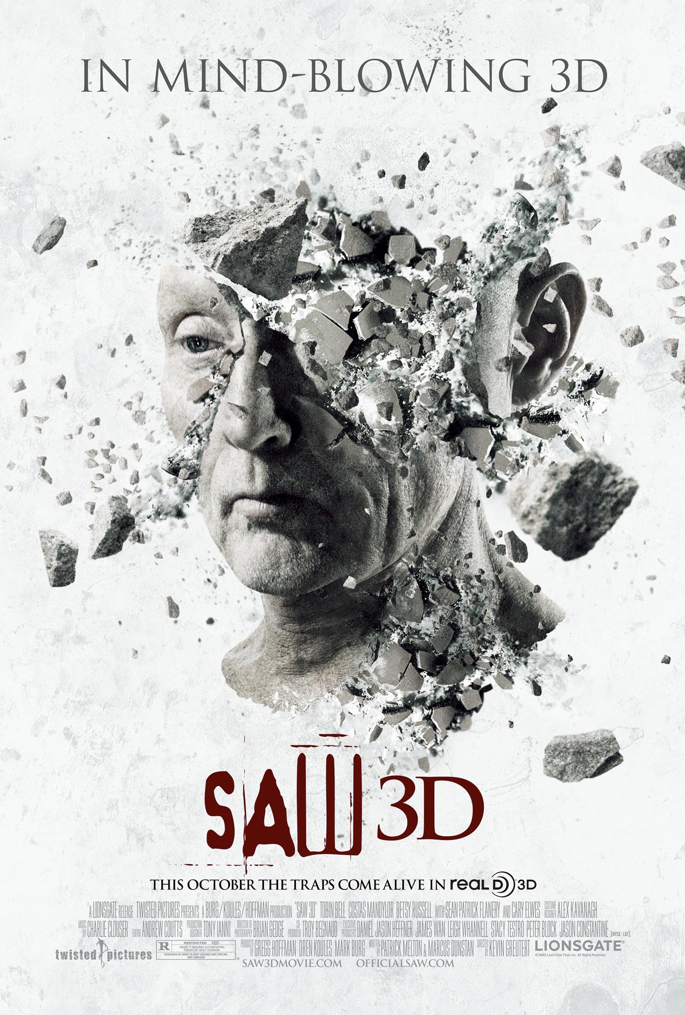
The saw franchise is undoubted extremely successful as shown by the release of seven consecutive films. Each film poster has all continued a specific theme of white and black and sometimes including red. This is so that it highlights the darker parts in contrast, most notably in the second poster where as if the poster where to have a black background it wouldn't stand out as much. The design is simple and gets the point across with each showing a different disturbing image. The word saw on each one shows the trademark font for the word so that the audience instantly knows.
Trailer
Within the trailer we are shown the story line that a bunch of people are being trapped in order to play a form of death game. we are then introduced to the main character and also his 'catch phrase' which is along the lines of "I want to play a game". The trailer is full of screams and people in confusion. There are fast paced jump cuts and towards the end the audio clips over lay to make it more overwhelming.
Magazine
In terms of magazine content this has none, this is due to the fact that anybody can walk into a shop and see the front cover of a magazine whether this be children or people who don't want to see aspects of horror in their every day lives. For this reason you will rarely ever find if a cover which shows a horror film.
Analysis of The Dark Knight Rises Campaign
Within this post I will be analysing The Dark Knight Rises
Campaign. Warner Brothers have used multiple methods in order build up the
anticipation for the release of the new batman film, I will split them into
four categories. Online/Viral, Magazine, Poster and Trailer. There are various
other methods but I will be Focusing on these.
Trailer
There are numerous trailers for Batman the Dark Knight Rises but for this purpose I will be looking at trailer number four. Within this trailer there is a heavy emphasis on it being the end though most of the scenes displayed. The trailer starts with us viewing the destruction caused by Bane (the villain) and then a child wondering if Batman will return. There is then another montage of destruction of 'Gotham city' and showing the defeat of Batman. There is utter chaos shown and it seems as if it is the end of the world, and or the end of Batman, which it is. The trailer is extremely dramatic all up until the end point in which it ends light heartedly on a comedic note to give some relief to the viewer and also know that the film doesn't take it self too seriously. The trailer is full of quick edits and dramatic sound effects, which all signify that the franchise is coming to its climax.
Magazine

Empire released two magazines which were both exactly the same, but only had a different magazine cover. As shown there is both one made for the Villain (Bane) and one for the Hero (Batman). This was done to familiarise the audience with the characters from the film. It also made it so these covers could become some what of a collectable for fans of the film.
Poster


Above are two movie posters which are iconic to the the batman franchise, both similar in style it makes it easy for a person to see that it is Batman from a glance. Both show the main character standing strong and in an angle which makes them seem powerful. Although the one on the right is slightly more sinister and the colour scheme is distinctly different to ensure fans will know it is a new film.
Viral/Online

A year before the film was released the dark knight rises
website was created. When you went onto
the site there was an audio file playing which sounded like chanting, within
this audio file was a hidden message which in basic terms said #thefirerises.
If any person were to go onto the social media site twitter and make a tweet
including #thefirerises this would unlock a pixel from a huge image, which
would in turn be the first image shown in relation to the film. That image is
the one displayed above, it is the villain within the film, Bane.
A similar campaign strategy then took place known as
''Operation Early Bird''. People could discover a website though a number of
means which would revealed a countdown saying when operation early bird would
commence. (shown below)

Doing this intrigued a wide audience and started to make
them curious. It created buzz for the Dark Knight Rises and spread the word.
Once the countdown hit zero there was map which showed all the places which the
movie could be viewed early. In doing this it made the prices of tickets rocket
increasing revenue for the film. Campaigns like this bring the community of
fans together and encourage them to make others excited.
Codes and conventions of Film Magazines
The most significant code and convention of a movie magazine is the masthead, or the magazine title, the companies who create these magazines need to make their magazine stand out amongst competition in order to survive in the economy we are in. They do this by trying to appeal to their target audience, this can be done in numerous ways. A simple way is keeping the colour scheme in check with the genre they are trying to sell. This way passing customers can easily identify what type of magazine they are looking for.
movie magazines will often have other conventions to entice their audience similar to movie posters magazines will often have their film star or stars as the focal point. This is because the audience will feel compelled to look out of interest of their favourite actor, or even because they feel familiar with the person. It is surprising how a large group can be more persuaded to buy a magazine due to the actor on the front, in our example there is a exception, because batman is such an iconic figure is it more suitable he is shown on the front cover, due to its overwhelming popularity it is assumed many know the part is played by Christian bale anyway. This in total creates a unique selling point for the magazine.
In our example below the colour sets the theme of the film, there is predominantly black and white used. The red writing is made to stand out as it is not the usual convention of a magazine this makes it eye catching as it seems as if the cover has been gratified until further inspection shows it is intentional, by then the audience has already taken interest and may be more convinced to read on.

Patterns of Intertextuality
This is how each of the following texts in this case 'Magazine covers' are similar to each other.

Here is a Magazine cover also made by total film which has many striking reassembles to the Batman cover above. A few examples of this is they both a have a specific colour scheme which runs throughout and both show the main character focused within the centre of the page.
Codes and conventions of Film posters
A typical code and convention of
a poster for a film is to be eye catching this can be achieved in numerous
ways, but it is important that it is done so that it will attract an audience.
The focal point of the image is usually the main actor with in the film, the
popular movie star who in turn will help market the film himself by being well
renowned in other films. Audiences are often drawn to see films because their
favourite actor plays a role, therefore it is important they know he/she is
featured in the film.
Within my example we see Christian Bale is our main focal point of the poster clearly showing him along with the title of the movie 'American Psycho'. As well as this the poster seems to have a artistic essence to it, containing a dark Gothic theme. This is evident due to the dark colours used, the consistency of red and black throughout.
We can also see that there has been editing done to the image, the colour has been corrected to make it feel more dramatic as well as the contrast has been lifted. A filter has also been applied which makes the image feel less realistic or possibly because it was taken on a older camera subtly suggesting what time the film is set in. The knife on the poster connotes violence anger and death, this provides a great contrast with the plain look upon his face giving the poster a chilling vibe. The knife is reflecting the image of his face showing that he is everything the knife connotes although because it is a reflection it also shows that this knowledge that he is a dangerous man can not be seen in plain sight.
There is also a pun added on the poster saying 'killer looks' which can be interpreted in numerous ways but it shows that at some points in the movie it doesn't take it self quite too seriously, but instead trying to add some slight humour. A billing board has been used as well on the bottom of the poster to inform the reader on the distributors of the film, the producers, the director and the cast.

The film poster for 'The Campaign' takes a different approach to advertising their film, the fact that these two films are completely different genres is clearly evident from the use of colours. Here is a use of bright light hearted colours such as blue and red which are also significant to the film as they are the colours of the party in which they represent. To reiterate again our focal point is the two main actors and movie stars, they are both well known for their previous parts and known for comedic acting.
Both actors staring at each other shows conflict but this is quickly blinded out by the quite obvious fact that both their noses are touching, for comedic effect. Both names are clearly shown at the bottom to clearly state who they are. The tagline at the bottom of the poster 'may the best loser win' is a contradictory statement which is not supposed to be take seriously. Straight away we can get a basic idea of the story line from just looking at the poster this is achieved from the image in the background of the white house and the clothes they are wearing. Both are wearing suits which connotes importance one with a blue tie and one with a red further showing the conflict, they are opposites.

To conclude film posters codes and conventions can show a clear suggestion of what the film could be about in terms of a plot and can affect audiences in different ways depending on how they like to be reacted by film posters.
History of Film Trailers
Over the past couple of years film trailers and the way in which we produce them has changed tremendously. A good example of how much we have changed over the past years is looking at particularly old trailer 'Psycho' Alfred Hitchcock well known film from the 1960's.
The trailer we see in this video is far different to what we can expect to see from a trailer. These are the years in which trailers were first being introduced and styles like these were being experimented with. In the video Alfred, the director, takes us on a tour of the movie's main settings. The aim was to interest the audience though pointing out key objects in the film. It also served as a way for fans of Alfred Hitchcock's films to get a sneak preview. Although in my opinion the trailer doesn't catch my attention in comparison to modern day trailers which are made to be memorable. It is extremely slow paced and long lasting while modern trailers are full of edits, sound effects and action. Finally it is notable that Hitchcock tells the story in more detail than you would usually get from a trailer today and also mentions where characters are killed, giving away spoilers in my eyes.
Subscribe to:
Posts (Atom)